How to Analyze Criterium Data To Become a Better Crit Racer

Every bike race offers an opportunity to learn and improve, no matter how you finish. By reviewing your performance afterward, you can see what you did right, understand what you could have done differently, and identify limiters to address in training. Let’s learn how to analyze data from a criterium so you can be a more effective competitor every time you race.
The 5 Steps of Criterium Analysis
- Use your Power Curve to see when you applied power
- Look at Normalized Power throughout the race
- Evaluate time spent in each power zone and time spent coasting
- Search for high-intensity intervals
- Compare PRs to your recent bests
Hidden Insights and Opportunities to Improve
Crits are exciting events in which strategy and luck can play as much of a role as fitness. Because of this, it’s easy to overlook how much you can learn from in-depth analysis of the power data from your race. Whether you came in first, last, or somewhere in between, the insights hidden in the data tell a more nuanced and complete story than your memory of the race, and can often reveal trends and patterns you’d otherwise overlook.
1. Use Your Power Curve to See When You Applied Power
Criteriums are incredibly stochastic, both from second to second and across the course of the event. By analyzing your power curve, you can better understand when you applied power during the event.
Why this is important depends on your goals. For instance, it’s extremely common for the first few laps of a crit to be very hard. While it’s unavoidable to expend energy during this time, overdoing it early on can ruin your sprint later. On the other hand, if your goal is to get into a breakaway, it may be worthwhile to burn a few matches during this period to make sure you get into the winning move. By running your mouse over the power curve for your event, you can track your expenditure through the course of the race. Clicking on a point in the curve allows you to highlight that duration on the workout’s map, so you can see where on the course you expended your highest power. Did your pace match your strategy?
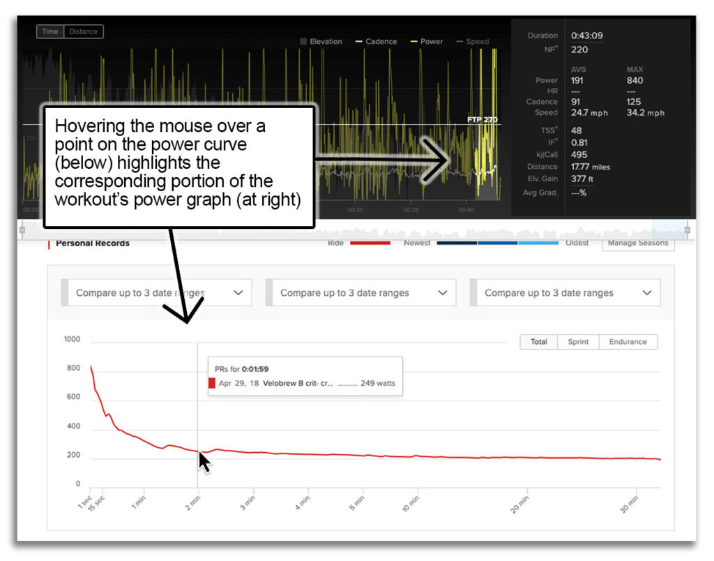
In this example, the athlete planned to contest the field sprint. Their hardest 2 minutes of the race came during the end of the last lap, a good indication that they successfully avoided working too hard earlier in the race in favor of saving energy for a strong finish.
2. Look at Normalized Power Throughout the Race
While your Power Curve is a great tool, it doesn’t capture how power was generated. Repeated surges are much more taxing than steadier, less-variable riding. Normalized Power corrects for this, placing greater emphasis on high-intensity efforts. This can be particularly telling in races when you get dropped. Oftentimes, average power in these races seems well within your ability, but Normalized Power can reveal you rode at your limit for too long. The greater the gap between Normalized Power and average power, the more inconsistent the application of power, and the more variable and taxing the effort is likely to be.
To view Normalized Power, drag your mouse across your race’s power graph. Normalized Power (NP) automatically reflects the section of the event you’ve selected. You can also zoom in on the selected portion for additional detail.
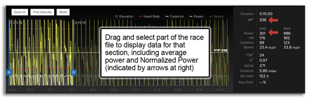
In this case, this athlete’s average power for the first 15 minutes of this event was 301w, well below their threshold of 348w. However, Normalized Power for this same period was 338w— much closer to their FTP and suggestive of a very taxing ride. Additionally, the discrepancy between average power and NP suggests a highly variable ride— caused by the athlete’s admittedly poor cornering and repeated surges out of every turn. The athlete was eventually dropped from the main group, unable to hold the pace after riding inefficiently early on. (Note: while Normalized Power is best used to analyze durations longer than 20 minutes, it can still be useful for shorter durations like this, to capture relative effort and variability.)
3. Evaluate Time in Zone and Time Spent Coasting
Criteriums are as much about recovery as they are about intensity. In fact, it’s often not the strongest rider who wins— instead, riders who successfully spend more time coasting or soft-pedaling manage to save more for the finish.
Analyzing the Power Zone chart for your event can tell you a lot about how well you managed your recovery during the race. The right balance differs from event to event and depending on strategy; if you’re in a breakaway, you’ll need to spend more time at Threshold, whereas a technical race spent in the field offers far more time coasting, but demands more high-intensity surges.
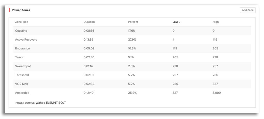
In this example, the athlete rode near the front of the field to stay safe during a technical 8-corner downtown event. While a whopping 25.9% of the race was spent at Anaerobic intensity, it was balanced by 45.5% of the race spent soft-pedaling or coasting, a strategy that allowed for a safe top-10 finish. Zone distribution can be viewed for an entire ride, as well as for individual durations selected within the workout.
Analytics
See your hard work pay off and understand your performance with powerful analysis tools.
Check Out TrainerRoad4. Search for High-Intensity Intervals
If you’ve ever done a tough interval workout, you know how repeated efforts wear you down and feel harder each time. But in the excitement of a race, it’s easy to overlook how many hard efforts you’ve done, until it’s too late and you’ve got nothing left.
Interval Search lets you identify these hard efforts. It’s available for your entire race, or if you highlight a certain portion of the ride you can search within it, and you can adjust both power and duration.
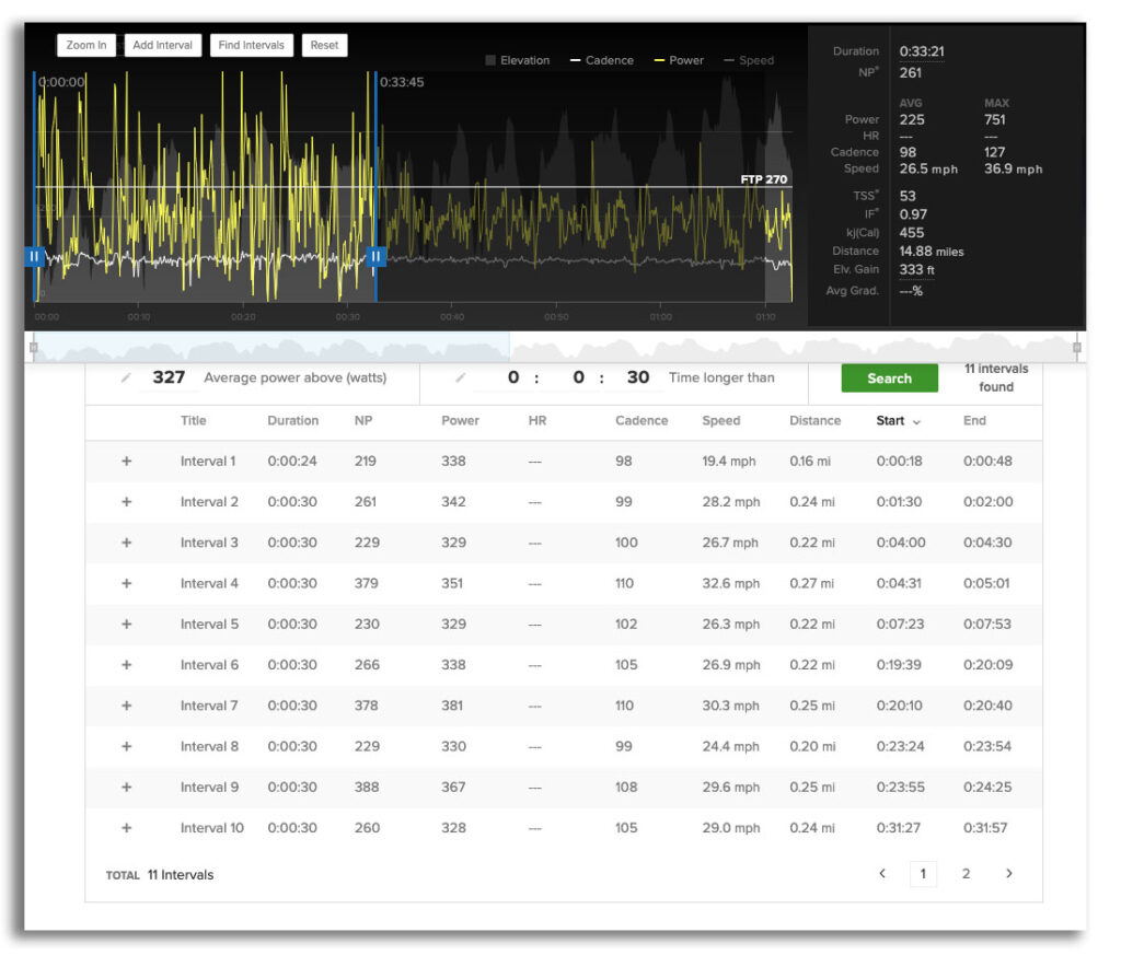
In this example, the athlete was competing in their second race of the day and was aggressively chasing attacks before being dropped when the pace rose around 33:00 into the event. While the data wouldn’t initially suggest the race was above their ability, interval search reveals that the athlete anaerobically surged for 30 seconds or more 11 times before hitting the wall. This is roughly equivalent to an on/off workout, and coupled with an earlier race left the athlete too exhausted to respond when the group surged.
5. Compare PRs to Your Recent Bests
Sometimes, a disappointing result obscures a breakthrough performance, with personal records hidden amidst a lackluster race. Other times the opposite may occur, with a hard race falling well short of your abilities and hinting at the need for rest or improvements in nutrition.
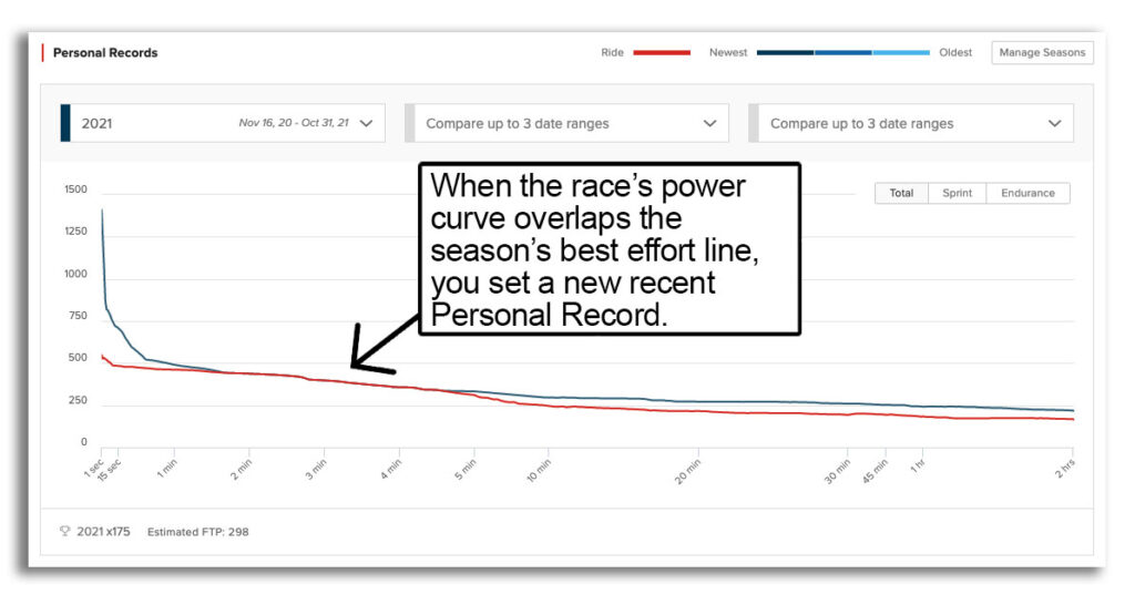
In this example, the athlete attempted to bridge from the field to the race-winning breakaway. They didn’t ultimately make it and finished mid-pack after being caught. However, they set multiple PRs for the season during this attack—an encouraging and confidence-inspiring sign of good fitness that race results alone don’t reveal.