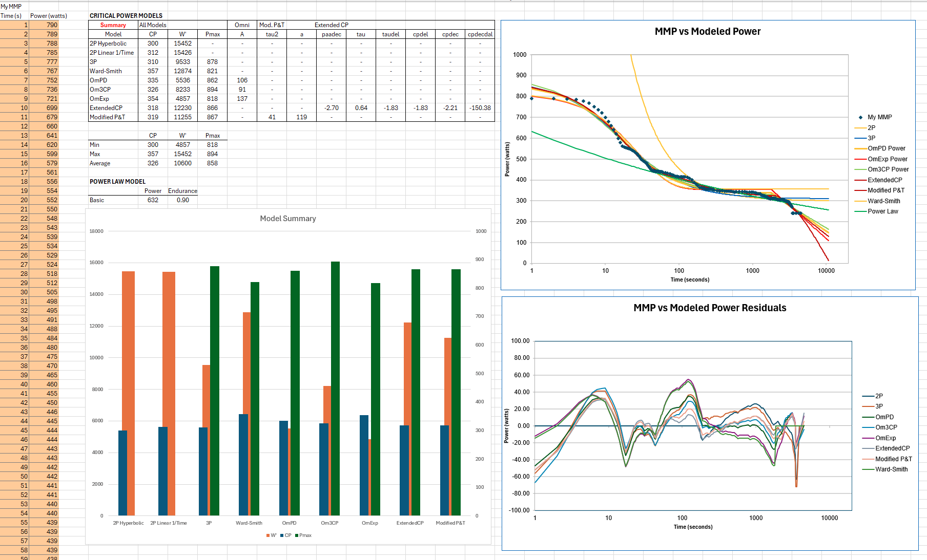
You could also use the spreadsheet I shared over at Intervals forum. There are 10 of the more popular models, mostly CP, that you can fit to your data. You can manipulate the fitting parameters for each model to see how the parameter changes the curve shape. I needed a way to quickly visualize small changes in MMP and their effect on the PDC and downstream modeled parameters like VO2max, VLaMax, and other correlations. You can use as few as 4 strategically placed data points to get reasonable fit.
My sheet is very basic and does a minimization on the sum of squares of the difference between the MMP and fitted curve points. There are far more elegant ways to fit the data, but I was keeping it simple. I show model residuals, too.
In the end, even with as much time as I spend analyzing data and doing metabolic testing at home, I do it for fun. If I want to really find threshold, I go for a run or ride to feeling.