Hi, I’ve been using and enjoying TR for a few weeks now, but there are many small things that are unintuitive for new users and instead of spamming the more experienced users Feature Request epic thread, I thought it better to create a new thread, specifically focusing on the things that would make life easier for users new to Trainer Road’s way of doing things.
Caveat: by new user I mean, unapologetically selfishly, me - a user who is familiar with FTP, HR, ERG, etc, and has used other apps (in my case Wahoo, and occasionally Zwift), but is new to TR.
So far my suggestions are all for the TR app UI, especially desktop version:
Calendar UI tweaks for clarity
What day is today? From the display it intuitively looks like the highlighted day is the most important. I would making the green/yellow/red days a little bit more subtle (e.g. just a bar at the top of each day) and the current day a little bit more prominent. Also, today is marked with a red box which is also a bit confusing based on the traffic light system.
This has definitely caught out more than just me. The fact that it’s based on the current calendar focus and not today’s FTP, is confusing when there is no indication that it’s doing that… In my example here, there are two FTPs visible in the calendar and neither of them correspond to the top right value. My suggestion is that as soon as you scroll and the FTP top right changes, it prefixes the date when it was measured.
…and there it explains that it has no effect in ERG mode. Just writing this note text in the settings would have saved this new user a lot of time. This is just one example, but there are lots of areas where a little bit more explanation, or context-sensitive UI, or a “what is this” link would go a long way without cluttering the day-to-day view.
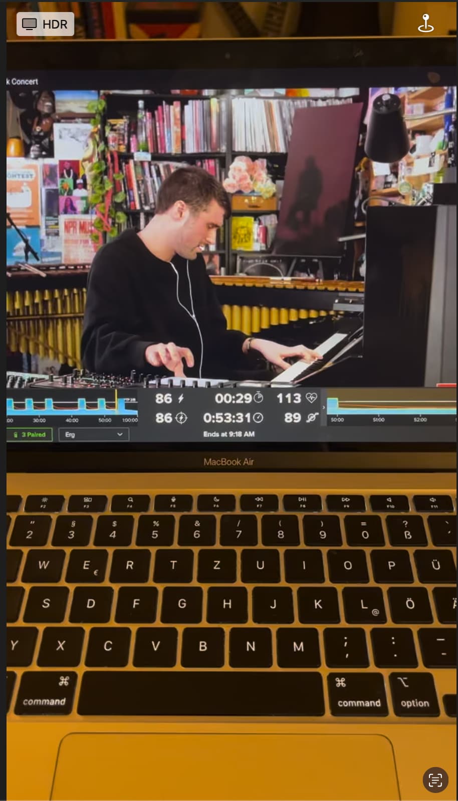
Mentioned already in the other feature request thread: icons instead of text in the mini app view, and better alignment for readability. On my laptop, the current text labels are tiny and hard to read at a normal trainer stand distance.
Ok, this is a screenshot of a video, but still, you can see how hard it is for us newbies to read the data labels…
As a beginner, if I see a feature called Red Light Green Light, I expect a feature that has red and green and not red and yellow. I know it’s marketing copy, but still plain speaking would help beginners.
FTP prediction needs to be “sliding”. I should be able to see my FTP prediction any time a month out, not have to wait a month for it to make a new “guess”.