This might have been a topic covered before but I thought share a thought about the design of the app as a new user.
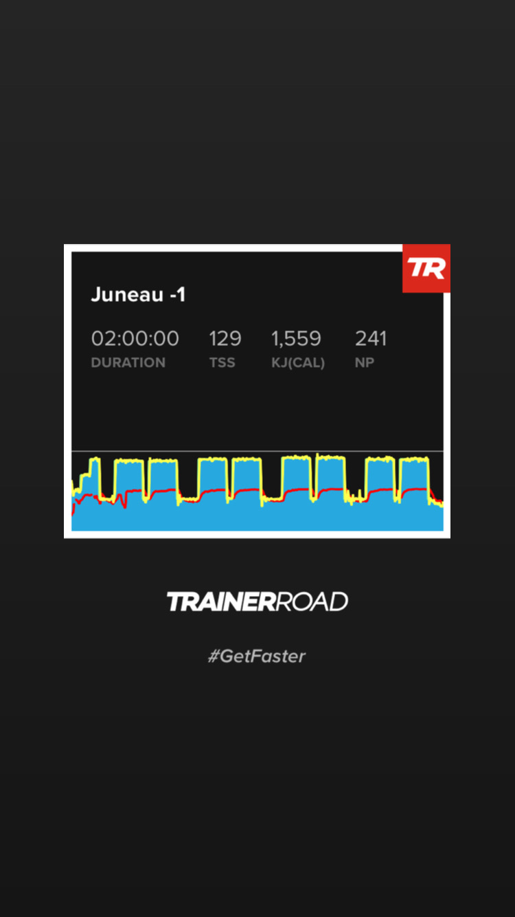
The thumbnails trainerroad generates for its rides are very descriptive but not particularly pretty. Obviously pretty graphs aren’t important to performance but as we enter another lockdown in the UK and more and more of my rides will be done indoors it got me thinking about why I dont share my training sessions on Strava (or anywhere else for that matter). I might be totally off base here, but I think that if the thumbnails looked mint there’s be a lot more people sharing trainerroad sessions on social media which could only be a positive for the company and the community around it.
“Looking mint” is a British expression usually used to talk about someone’s dress sense. So Bryan Ferry in Roxy Music would be “mint” but Kurt Cobain wouldn’t. (No offence meant to Kurt Cobain BTW)
Having said that, not sure how you could make a graph of power output “nicer”
Yeh sorry, I forgot that “mint” was probably my Australian vernacular.
But great questions. Looks are totally subjective, but typically design tries to combine form and function. I think we can agree the TR graphs and thumbnails are much more function end of that spectrum.
If we want to be a little more analytical about what I mean here- there are two reasons the design might be considered a negative. Firstly, the design in no way relates to the overall branding and design of the trainerroad ecosystem. If we look at the graphs they might be something you’d see come back from a doctor’s office, or a auto repair wheel alignment… or trainnerroad. You’ll notice that everything here on the website, forum and youtube channels have consistent design aimed at clarity, minimalism and ease of use. The training graph design doesnt carry that over at all. Maybe that’s not a huge deal, but as its the only images that TR gives its users to share on social media I think its a missed opportunity.
Secondly, and more importantly IMO, the design isn’t as clear as it could be for anyone but experienced TR users. If we compare it to something like the Zwift training graphs and workout graphs, they’re colour coded in a super clear and elegant way. I know as a new user that those red intervals are going to hurt. Also, zwift cleverly uses branding colours for displaying the training zone. Even after a couple of months of use I can’t quickly guess if an interval is going to be SS or threshold, Upper zone 2 or tempo. You really have to read the plan to get a sense of that.
Anyway, hope that makes sense. I’m really enjoying using TR.
If they made more sense to non users we may get asked about them more and be able to give away our free month codes. I heard a rumor that for every code you give away in 2021 you get entered into a drawing for 20 free watts of FTP.
I could see developing some versions of ways to rank and show this in new/different ways.
Something like a 1-5 star rating, a tachometer or speedometer, other commonly understood symbol of progress or power… and use that to “rank” the workout.
Overall difficulty, compliance or other metrics that could be shown in more easily understood ways by people without a training background.
As usual, my logical mind thinks it’s unnecessary at first, but the more I consider it, I think there are gains to be had here.
Might be nice if the ramp test image that goes onto Strava included the result! Since every time I test somebody comments to ask what I got. And one of the most commonly shared screen grabs that I see from cyclists is new FTP scores whether from Zwift, Garmin, TP, et.
Haha yeh. social media is where I think the gains for TR would be massive. I think there would be some modest gains for regular users like us too. Thanks for helping me clarify my question.
True, but if it’s a test I don’t want people to know about then I normally set the whole workout to private anyway. While trying to ignore the little Chad voice in my head saying “you are not your FTP”…
The lines are too coarse and it could use more colors.
This is strictly with regards to the image that auto-uploads to Strava. It’s not “pretty” inside of a Strava feed and it magnifies/exaggerates spikes and dips in power.
Nothing needs to be changed inside of TR. This can entirely post-processed. Does TR have an API?
It’s a good idea. Will definitely benefit TR from a marketing standpoint and for anyone who actively uses Strava as a social media platform.
OK, so like @mcneese.chad my initial reaction to this was what on earth would you do to make it better… but the thread throws up some good points. Some sort of colour differential on the blue block to show what zone you’ve been in? A clear indication that the FTP line is just that - maybe with the number?
I think a quick win might be a ride summary superimposition top left of the screen grab, where there’s always blank space - particularly showing info Strava doesn’t - so
TSS
IF
NP
TIZ (probably just for the target zones of that workout?)
But most of all NP. Usually far more impressive to the casual Strava observer than the average power they routinely display!
agree with this. the actual power line lower ‘resolution’ or something. i hate it. it doesn’t reflect the workout the same way as it does on TR app/website.