Go ahead and get working on that rather than complaining about it. I mean calling this work a wannabe is crass and doesn’t fit the spirit of this forum. If you don’t like it, given it’s free, just move on.
14 Likes
So basically, you’re dunking on a guy who as far as I know has created a website in his own time, that is available and usable free for any athlete, because it doesn’t match the standard of… a project launched by USA Swimming’s Director of Sports Science and Physiology, used for Olympians, utilising state-of-the-art underwater cameras?
OK.
24 Likes
Maybe after I retire I will have time for a second career. ![]()
I’m “dunking” on everybody.
@davidtinker intervals.icu isn’t an open source project resp. on github, is it?
Great work btw!
1 Like
Found intervals.icu two months ago and really love it. Keep up the good work @davidtinker!
Minor improvements I would like to see:
In my opinion the calender view under “activities” is a bit unlcear. The TR calender is more neatly arranged, in my opinion. Otherwise, I love it.
4 Likes
Hi David,
Can I just mention that I’m really not keen on this method of recording your FTP history, ie. with FTP being entered solely as an attribute of an Activity (multiple activities) as opposed to it being modeled and captured as something in its own right with a dated history of values.
Same thing for other date-based personal attributes like weight, and for me, it would be a lot more intuitive and visible to record FTP / weight / etc. in a way that reflected that, perhaps akin to how M. Champagne is doing it.
Kudos for taking a web-based approach though in order to give the greatest accessibility. Being on a Chromebook, Elevate will lose me when it goes desktop-only and the extension eventually gets dropped. ![]()
2 Likes
Intervals.icu isn’t an open source project resp. on github, is it?
Not currently. I might do that someday but the code would need a bit of a cleanup first ![]() The backend is a Java Springboot application and the front-end is Vuejs + Vuetify components and d3js for charts.
The backend is a Java Springboot application and the front-end is Vuejs + Vuetify components and d3js for charts.
6 Likes
I will have a look at how Elevate is capturing weight, FTP etc…
1 Like
quick follow up question on FTP and how it is implemented on your site:
How do you calculate the estimate of the 42d FTP in the power tab and the estimated FTP in the fitnesstab? Are past workouts (or the lack therof) on the fitnesstab not taken into account for this estimate?
My estimate is roughly 20 watts higher than my 42 day FTP. I did essentially nothing in the past 42 days and got 284 on a RAMP Test this monday. So in my case the 42d value more closely represents actual FTP than the estimate on the fitness tab. I guess those two numbers will align as I ramp up my training but it seems odd that the fitness chart would be so far off.
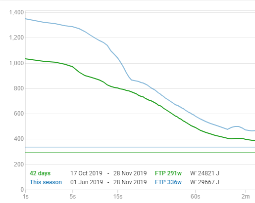

Also: why would FTP/kg be displayed based on the estimated FTP rather than the manually entered FTP?
Thank you David for taking time out of your day and providing this great analysis tool! I really appreciate your work and effort that goes into this and the time and patience for answering all our question here on the forum and probably elsewhere as well! Have a good day
3 Likes
I agree your comments on the calendar, as well. I personally do not like the inverted calendar representation as it runs counter to basically every calendar in existence (I feel the same way about Strava’s calendar). If previous workouts were up and future workouts were down, I would like the calendar view a lot more, but as it stands, I get super confused trying to read it and stick to the list view instead.
That said, I really enjoy basically everything else about the site. It is one of the best visual representations of my workout data to review. Great job to @davidtinker on it thus far!
5 Likes
Not really a suggestion for new data metrics, but it would be nice if on the calendar, the name of the workout was on the blue bar instead of the ride time / distance.
3 Likes
How do you calculate the estimate of the 42d FTP in the power tab and the estimated FTP in the fitnesstab?
The 42d estimated FTP on the power curve chart is calculated using only rides for the last 42 days and you can choose the model (M&S, Morton 3P, FFT curves + Morton 3P). The /fitness page uses estimated FTP calculated for every ride using FFT curves + Morton 3P. If a ride has a higher estimated FTP (i.e. you hit power numbers that placed you on a higher curve) then it goes up. Otherwise it stays the same or decays slowly if your training load has been declining. Intervals.icu doesn’t know that the ramp test was a max effort (I suppose I could look at HR as well but it doesn’t do that currently) so it doesn’t reset your estimated FTP. At least the 42d isn’t too far off.
why would FTP/kg be displayed based on the estimated FTP rather than the manually entered FTP?
I did think about using manually entered FTP but its nice to have an “automatic” measure on that chart. I will probably add an option to choose manual at some point.
Thanks for the positive comments!
2 Likes
The calendar is “inverted” because usually you scroll down on a web page to see more stuff so thats where the older activities need to go. That seemed like the obvious way to build it when I started and I hadn’t seen the TR or TP calendars yet.
4 Likes
It would be nice to be able to see the Zone average breakdown you now see per week in the calender view also in a plot over time. Data is obviously already there. In a plot, you could potentially also build in the option to see a monthly/yearly average, or even a rolling weekly average.
5 Likes
Gotcha. The list view works perfectly fine for my purposes, and the individual workout visual representations is also spot on. I appreciate the work you’ve put into it and use it after every ride!
2 Likes
I see what you did there ![]()
You should hook up with the TR team, and build a version of intervals.icu straight into TR as the beginning of TR’s advanced metrics ![]()
18 Likes
My main gripe with the Intervals.icu Calendar is the way in which multi-day TR annotations are displayed: instead of a single annotation being shown spanning multiple days (and taking up a single line of screen real estate), multiple instances of the annotation are shown, one for each day, with each containing the full annotation text (and due to the word wrapping, each taking up multiple, eg. 7, display lines of screen space)…
This can end up looking a bit of a mess and severely limits how many weeks (additional to the current week) can be viewed simultaneously without further scrolling.
NB I realise this is probably a bit of an edge case, as I make extensive use of multi-day TR calendar annotations (flagging up things such as travel plans, various types of TR plan comments, sickness, etc). Even got a colour scheme for different types ![]()
1 Like
Hmm. I had a look at your calendar and I see the problem. It was taking way too long to get the planning part of the calendar done so I rendered multi-day entries the “easy” way. I will see what I can do about that. If you could get some of the text out of the title into the description, that would help for now.
I changed one of your “notes” that said “sick” to be of category “Sick” which gives it a nice yellow/green snot colour. It now also shows up on the fitness chart so you can see why your fitness took a dip.
4 Likes