Not sure I understand the question, but on each individual activity there are lots of ways to compare your ride HR vs PWR - look at the side bar for each activity for further detail.
Basically to see over time HR for a certain power is decreasing or increasing.
I.e. last month av. 200w could be 160bpm and now 150bpm.


Does it feel like lower intensities are a struggle now. If not I wouldn’t worry about it, HR can be such a fickle thing and short term work low intensity work is more likely to be affected by these fickle fluctuations. There could be hundreds of explanations if you want to dive down the rabbit hole.
You’re maybe spinning more that makes your HR higher at lower intensities but that increased cadence is facilitating keeping a more stable HR at higher intensities but then again it could just be that 13 days in April is too short and its being influenced by one day which falsely creates a picture. (you were sick one day or the meters suffered a bit of interference that day).
Good question. Lower doesn’t feel a struggle but weird after a 2 hour zone 2 ride i’ll feel way more wrecked than an 1.5 hour 5x5 vo2 session.
What has your training looked like recently - have you been doing much endurance riding for example? As per any model it will depend what you feed it.
I quite consistently (2-3 times a week) do a 2hr upper zone 2 workout for the last 6+ months so have good data points around the 75% MaxHR marker.
Training has been polarised since Jan. So basically zone 2 or Vo2 / anaerobic. That said im really bad a zone 2 and find it horrendously boring so it often strays into tempo


A steady upward trend in the Efficiency Factor metric as I progress across a season - looking for when it starts to stabilise which could indicate a need to change things up; extend endurance ride duration or add some different stimulus and/ or intensity.
Just after half way in my graph I start to plateau my EF as I come to the end of my base phase and a SST TTE block - I changed things up and moved into a Threshold TTE block, increasing EF further before moving on to a Vo2 block.
Its not an exact science and sometimes works out after the fact, but I do see some value in tracking it.
I wonder about that too. My TR FTP has been 220 but yesterday I did a vigorous group ride and Intervals bumped my FTP by 24 W from 218 to 244 based on 19 minutes at 257 W. I think that my ride supports a healthy bump, but I’m not sure whether to adjust my TR FTP manually or wait to see what the TR’s AI model will do in 2 weeks.
Hey David,
5 days ago we exchanged private messages re: using of laps from Garmin, and I gave you specific details of how to extract TrainingPeaks interval names.
Last night you announced:
And my workout last night now has TrainingPeaks lap names:

Thank You!
Now in addition to extracting the notes from workout_step, you just need to extract the custom_target_value_low and _high

So you can make pretty target-vs-actual pics like TP:

![]()
It’s a couple weeks since you posted this but…
The ‘fatigue’ line is a weighted average of your recent training load (I think it defaults to 7 days and sometimes called ATL or Acute Training Load) and the ‘fitness’ line is the weighted average of your longer term training load (usually defaults to 42 days and sometimes called CTL or Chronic Training Load). Training load measured by TSS.
Are you sure you’re looking at the lines right? Sounds like you might have them backwards though due to the rolling average there can sometimes be a bit of a delay in their movement.
This is mine, the red section is a build with fatigue above fitness and the blue is a recovery with fatigue dropping below fitness.
Your easy week would probably have a lower training than the previous 5 weeks of training. So not long enough for your ‘fitness’ to decline but enough for you to shed fatigue.
It can take a handful of hard rides to bring that fatigue line back above the fitness line sometimes.
It is just showing that your ATL is lower than your CTL. If you are reading the chart correctly, it shows that your last week of training is lower than the average of the last 6 weeks. So if you are trying to overload then yeah you could probably handle more volume.
I think the eFTP estimate uses data from the last 90 days or so. So depending on how far back that test was it might not be taking it into account.
Thanks for the reply. I was looking at the graph incorrectly. The last couple weeks shows Fitness mid 80s and Fatigue 105+, this week is an easy week so there is only a difference of 3 between them now. I have no idea what the Fitness and Fatigue numbers should be, but after a few hard weeks in the mid 80s and 105+, I was pretty spent.
So the number your referring to is known as Form (or Training Stress Balance (TSB)) and it is Fitness - Fatigue.
At -25+ I’m usually pretty tired. I usually only hit this at the end of a block or training camp where I was looking to overload going into scheduled recovery. Otherwise I’m in the -10 to -20 range for building weeks and then it climbs to between 5 and 15 at the end of recovery weeks.
Don’t get too caught up in these numbers though. They are many times a side effect of the training and shouldn’t be seen as the goal (to drive the numbers higher). But if you are questioning your recent volume and if it’s too much then they can help to give you some bumpers.
Hey @davidtinker thanks for adding the cross linking to highlight detected intervals. Appreciate you acting so quickly on my suggestions.
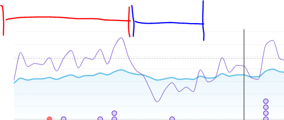
Quick question… I’m always left wondering why your detection algorithm does stuff like this:
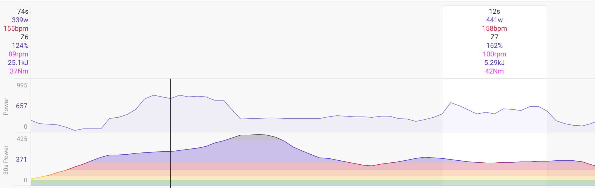
The 12 seconds on the left is something like 630W, and the detected 12s is almost 200W less at 441W.
I’d be happy hearing you say “its complicated” because I’m an algorithm guy and pragmatic. And you don’t have to remind me that I can add my own interval, that’s not the point. I’ve often wanted to write a tool that had power curve for selected duration, and then scroll thru power curve to highlight the timeline. Just one of many pipe dreams.
I linked apple health to google fit to intervals.icu to automate pulling my weight data in.
I am not sure why it didn’t pickup the 1st. Certainly looks like it should. I have simpler “manually managed” detection on the todo list: enter power and all sections of the ride with that average power are picked up. That sounds similar to your suggestion.
That would be nice.