Great observation!
Got it, good catch! I’ll pass that info along, thanks! ![]()
2 Likes
Alrighty, we should be good to go on both light and dark modes now! Please let me know if you run into any other display issues.
6 Likes
OK, works like shown above now, thanks.
1 Like
![]() my eyes thank you!
my eyes thank you!
2 Likes
Wonder if they just shrunk them? Mini-skittles.
Definitvely looks better now.
2 Likes
These little colored dashes are not great interface design. They’re somehow prominent and also too small to convey information. It’s not an improvement on mobile at all. They also add a blank line at the end of every post in the listing of posts. Clunky
2 Likes
TIL there’s dark mode! My eyes are so pleased!
1 Like
I’m sure there are mixed views on this, with some people loving it, but personally I find the recent change to the main forum page (the lists of threads page) whereby the category title and colour code are now displayed beneath each thread title, to be really annoying…
This visual clutter makes it harder to quickly scan the list of threads to see if there are any of interest. I’m sure plenty (most?) of us aren’t much bothered about what category a thread lies within - certainly all I’m interested in is “is the thread subject of interest?” - and definitely not to the extent of having the category displayed so prominently that it clutters things up*.
Is there a way to revert back to the prior UI appearance?
* Battle of the OCDers? Categorizers vs Declutterers ![]()
3 Likes
I moved your post under one from earlier this year that is more closely related to your concern.
I noticed the change early last week and remembered this prior issue, but decided to wait and see if anyone complained.
It is most ikely from another pushed update in the Discourse forum software. I will ask @ZackeryWeimer to check this out again for us.
5 Likes
Thanks, Chad.
From the older thread, seems it got whacked on mobile but has now snuck onto desktop - but the good news is it appears it can be fixed! ![]()
1 Like
Thanks for the heads up! We’re taking a look into this now.
3 Likes
I realize this is possibly in flux, but it appears right now that Categories are “missing” or “removed” entirely???
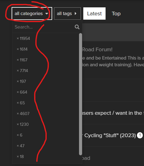
This image above used to show the main categories like:
- Equipment
- Nutrition
- Training
- TrainerRoad Software
- Etc…
I agree that we were trying to remove the extra display lines shown in some viewing situations, but I sure would like to maintain the use of Categories as we’ve done from the start.
1 Like
A number of things aren’t right: the issue Chad mentions, plus some category titles are still displaying beneath thread titles on the main page, and the style/font size of posts has been impacted too.
At present, looks like work in progress rather than a proper fix.
2 Likes
Yes, work in progress at the moment – hopefully resolved soon! ![]()
3 Likes
Your logo in footer on mobile is not scaling and as there is no overflow hiddien in main container whole page is moving horizontally.
It seems to be that time of the year again when the Discourse forum software gets updated and the UI changes as a result ![]()
Is tweaking this back to its original look still a thing (please)? ![]()
4 Likes
Good question again for @ZackeryWeimer, because I don’t have access to that.
2 Likes
We are taking a look into this now!
3 Likes