I searched but didn’t find anything.
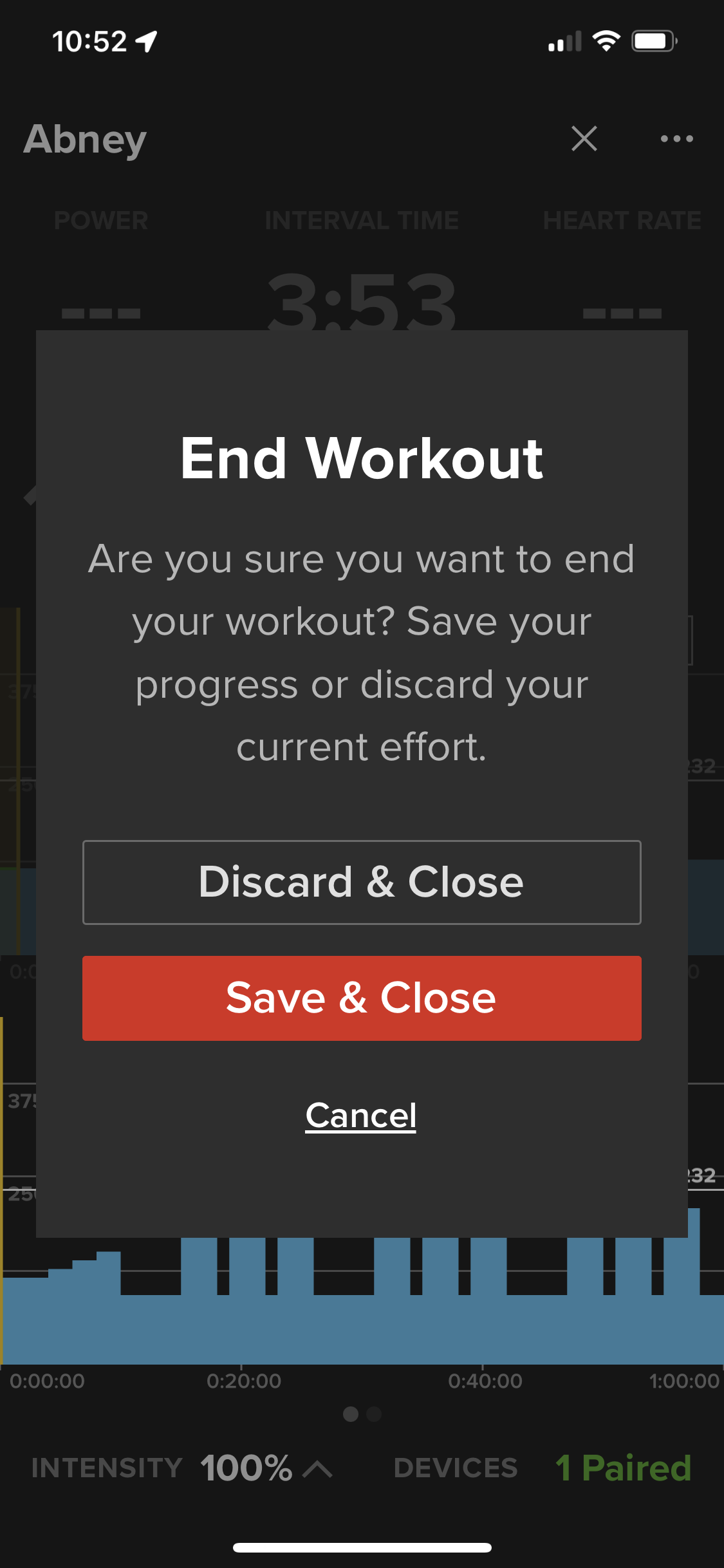
I might be the only one, but after a difficult workout and accompanying lack of coordination and abundance sweat, I would love it if the save and discard buttons were farther apart on iOS. Thankfully there is a check when you discard but I’ve pushed the wrong button a few times. It seems like an easy change. Would there be a reason for them to be adjacent?