Hey There. Did something change in the format of the Athlete Levels bar graph recently (within a week or so)? See the two images below. It used to describe the increase that the workout had on my levels. Now I see other white lines and no numeric value. In the “new” workout below, I don’t think right of the white tick represents the level increase that this workout had… well, I’m quite sure of it.
It just looks a bit weird because you didn’t exceed your previous levels on any zone. If you did, there might also have been the white number. The rest probably came along with the big AI changes earlier this year, when workouts also started to affect multiple zones.
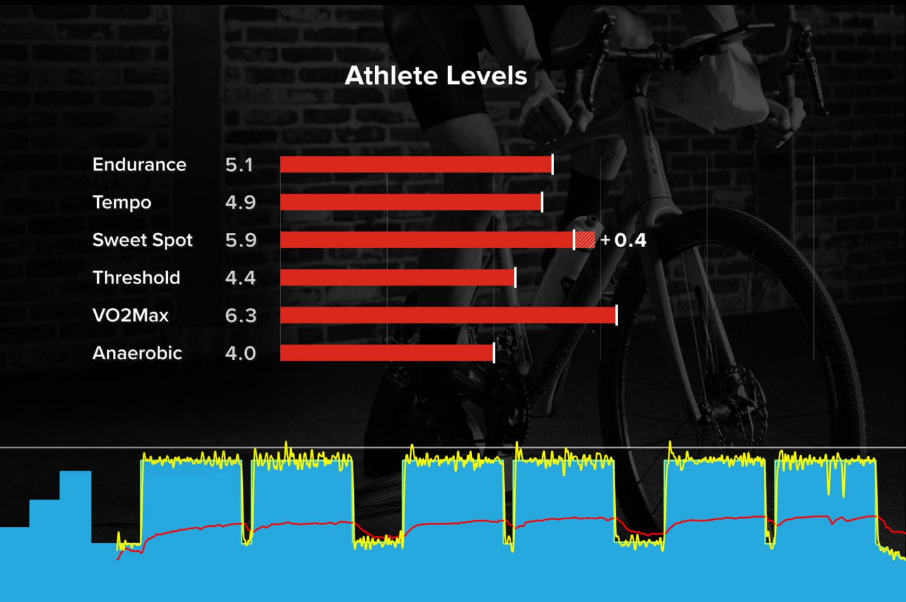
This gives us the numbers you achieved on the workout against the intended levels on the workout.
Now compare these to your overall progression levels on your career page.
That 3.1 endurance for this workout is about 60% of the way across your red bar with a 5.1 endurance score, right where I’d expect 3.1 to land.
VO2, achieving a 6.0 when your score is 6.1, the white tick is very close to the end, as expected, tempo being 1.5, is like 30% of the way across your 4.9 tempo score.
So the tick is this specific workout’s score vs your red bars being your overall progression level.
@mikehustler, The white ticks are what you accomplished on the workout vs. your current Progression Levels. On that VO2 Max workout you didn’t exceed any of the existing levels you already have on your PLs.
Thanks @dfquigley for engagement on this! Not sure why I was confused I guess the fact I didn’t have any “exceeds” threw me … subconscious disappointment lol!