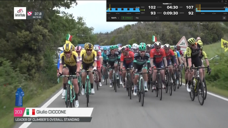
I usually run some cycling video in background while doing TR workouts. TrainerRoad’s window is switched to minimal mode, but I have a feeling that it unnecessary hides portion of the picture. Could you please reevaluate that usage scenario and see it there is a room for improvements?
For example, I tried to play with minimalistic layout in Paint and got the following picture. I moved some of UI elements there without sacrificing font sizes and removed chart of current interval, because it mostly duplicates digital timer. It allowed me to save noticeable portion of background picture. You might also notice that I changed trainer mode control to plain buttons. Single mouse click to switch mode is easier than selecting item in dropdown list during workout. Anyway, I’m sure you can make good layout anyway
Thanks so much for taking the time to share your feature request. I really like your super-minimal rendition, and I will share this with our design team. Making minimal mode more minimal is something on radar, so we appreciate your inspiration .
I second the excitement over allowing subtitles to display - I have them on all the time (chips are crunchy), but especially handy with a first-gen kickr whirring away
Also, I guess you don’t need that bottom row (3 Paired etc.) to appear unless you’ve rolled over the TR window so that is some more space saving.
Separately, I’ve wondered why they show my power (102w) rather than just the target power and the green / red bar that shows compliance. Not sure how others feel but that is something I could do without (as well as the leading zeros on the interval and workout times ).
The regular interface is a whole other ball of wax. Lots of room for improvement there. Should be way easier to:
See the second screen with kilojoules etc (I didn’t even discover that for 2 years)
Navigate to devices for easy calibration after 10 mins
Change to different % efforts. Weird that I have to click on 100% to bring up the interface to change %… and then to make that interface go away again, I need to click on the % at the bottom again… )
I know it is supposed to be simple… but could be improved a lot to ‘not make me think’.
I find if I drag box to top right of screen then go right so cadence is first thing showing from the right (don’t need tonsee graph!) then can watch films no issue - with subtitles yes due to trainer noise!