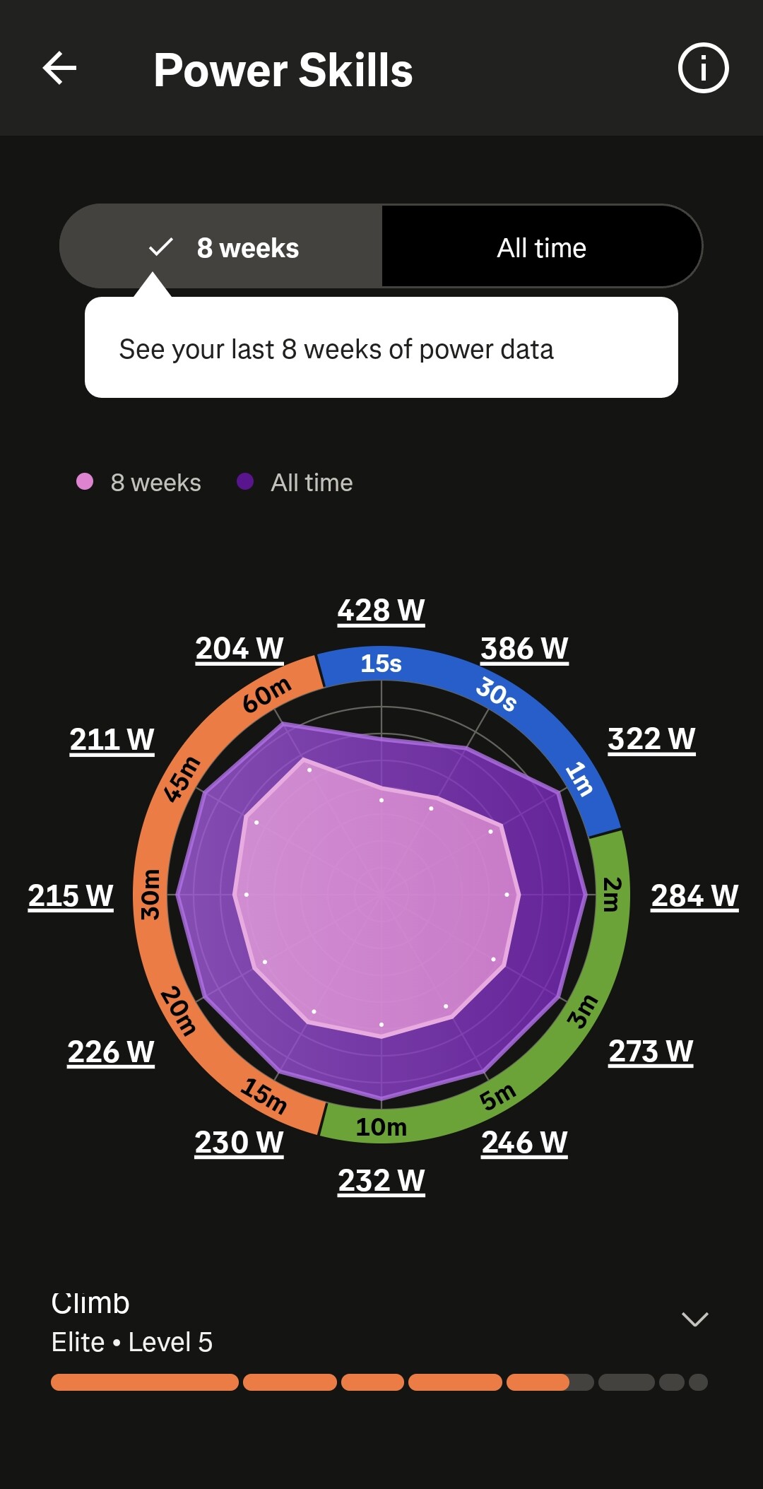
Yes, the Breakaway showing the last 8 weeks compared to all is much better.
I have not checked what the ”all” in Breakaway contains, but the ”all” in Strava seems to use literally all data. Some of the figures it shows are taken from my activities that took place more than ten years ago.
>>>me>Subscription Overview, I then scroll down to the ‘Train’ heading and Power Skills is the second item under that heading.<<<
Thanks, but still no joy. I think I’ve tapped on every possible tappable item in the Strava app and haven’t yet found it. Maybe I’ll go to Strava’s users’ forum and ask there. Now there’s an idea!
Mine looks reasonable and jives with my event experience by age bracket.
If you have bad data, it’s easy enough to fix following the last entry in this article. Power Skills on Strava – Strava Support
They’ve moved it into the ‘You’ menu (bottom right tab on the home page) for me today, with a big highlight ‘New - Powers Skills’ having appeared next to the ‘You’ tab.
Welp. I finally got it after uninstalling and reinstalling the app again today. I had done that yesterday and the day before, but it wasn’t until today that I got it. This was, btw, after receiving an email from STRAVA support this morning saying to try it again.
Nice. I like it. Anyway, I got a roughly circular purple blob in the middle of my radar chart which shows I suck pretty equally at sprinting, attacking, and climbing.
These graphics all feel like some kind of XKCD infographic: “Compared to a population in which you are in the top 2%, you are better than 98% of the people you are being compared to."