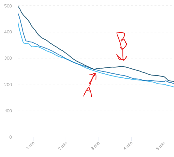
This is the 3:45 interval with an average power of 269, and you can view it for yourself here.
In this workout, you set new PRs for 2:53 through 3:45. Click the link above and try creeping the interval shorter one second at a time and watch the average power. You’ll notice that the average power does not go up as you shorten the duration due to the spikes at either end of the workout. It trends downwards.
This is the 2:53 interval with an average power of 258. As you can see, you lose that spike on the left side of the chart, which makes the average power for the interval lower.
Thanks a million, @Bryce. I didn’t know that I could go from the power curve to the interval like that, and it hadn’t occurred to me that spikes at the start and end of a time period, with lower values in the middle, would yield that result. I had tried to look at it several different ways, but missed that by a mile. Learned a couple of things today!
@Nate_Pearson, take note: THIS is the kind of spot-on, detailed, helpful, one-step-beyond educational SUPPORT that will keep me and many others paying for TrainerRoad long after open-source AI can design our training plans. The software is great, but it’s the human element where TrainerRoad shines and differentiates itself as a company. Whatever you do to reward excellence in one’s work, Bryce has earned another one.
This has been bugging me only this season. It took a while for me to independently come to your conclusions. I have been doing a number of Threshold workouts in quick succession, so I get very structured points in the PR curve for the interval times and then anomalies either side depending on how much of rest recoveries and adjacent intervals are included. Must not have been so jarringly explicit in the past.
I was going to say that this wasn’t repeated in other software. A quick scan - Intervals.cc exhibits the same problem. However, I think Golden Cheetah and Training Peaks take a smoothed curve or fewer data points and display that.
Logically, if you can achieve an average of Y for time X, you must be able to hold >=Y for X-n, even if it’s not been demonstrated. Is there not an algorithm tweak in the graphing of PRs that would draw a horizontal line left from each power PR until bested by a greater average? @Nate_Pearson, a hard or easy maths and coding problem?
Think of this in real time. Scenario:
End of a race, you sprint for 30sec at 400w to get in position, then you hold 200w for 30 sec to hold your position, then you sprint for the finish for another 30 sec at 400w.
Your 1 min power will be either end of this scenario.
30 sec at 400w + 30 sec at 200w = 600w / (2 sections at 30 sec) = 300w
OR
(30 sec at 200w + 30 sec at 400)w = 600w / (2 sections at 30 sec) = 300w
It can’t be both the 30 sec at either end added together, because it has to be continuous.
So your 1 min 30 sec power will be:
(30 sec at 400w + 30 sec at 200w + 30 sec at 400w) = 1000w / (3 sections at 30 sec) = 333w
@WindWarrior, interesting the distinction.
I haven’t seen the PDC on Intervals.cc - I see a drop and rise similar to the TR PR curve - so it looks more like an MMP.
On GoldenCheetah, the modelled PDC is a bit frustrating as I can’t seem to investigate it - actually extract the plot points as a useful reference. Hovering over the MMP for any given time gives the wattage, but I can’t get this from the curve.
@Jbakkane I get your point. The TR PR curve is mathematically exactly what has been achieved in that timeframe. However, intuitively, if I can hold 333w for 1:30, I can clearly hold the same at least, for 1:00. For those of us who don’t do enough maximal efforts, because we’re busy doing intervals, the PR curve becomes increasingly less helpful. However, I appreciate that if TR “filled in the blanks” with a horizontal line, this would cause problems when referencing back to the original power file.
On Intervals, I was being a bit thick. I had the “show sub-maximal efforts” ticked, which removed the modelled numbers from the floating labels and replaced them. I can see the Modelled numbers now.
On GC, on first glance, the only difference I had was Unticked “Filter Unique bests” and ticked “Show sustained efforts”. But whatever I’ve done, I can now see the numbers for the mPDC floating as I cursor the curve. Thanks for taking the time.
Incidentally, do you know what the “filter unique bests” and “Show sustained efforts” does?
Interestingly, I can also see dips in my MMP - clearly they have been subtle enough in the past, or I’ve been further into a season so I haven’t noticed them before.
Ironically, I played with those settings again, and when I clicked on sustained efforts, I lost the ability to investigate the mPDC. There’s something buggy. Will eventually crack what combination I need to click to get it back…
Yeah, you might need rest between higher wattage outputs. Though I wonder if there was a way to make a chart that represents the longest power that you can sustain and not need rest. Maybe the max average for each time length but throw out the ones where x% of the data is over a standard deviation lower then the average
and doing a quick “sustained” search in the GoldenCheetah source code, I pulled up and spent 5 minutes trying to inspect the code in SustainMetric.cpp, CriticalPowerWindow.cpp, RideFile.cpp, and CPPlot.cpp. Didn’t spend enough time to follow all the code, just got a sense of it to try and following along with the blog post I quickly skimmed.
Going off the blog post, it appears the code looks for sustained efforts within 85% of MMP or modeled curve, not really sure of details.
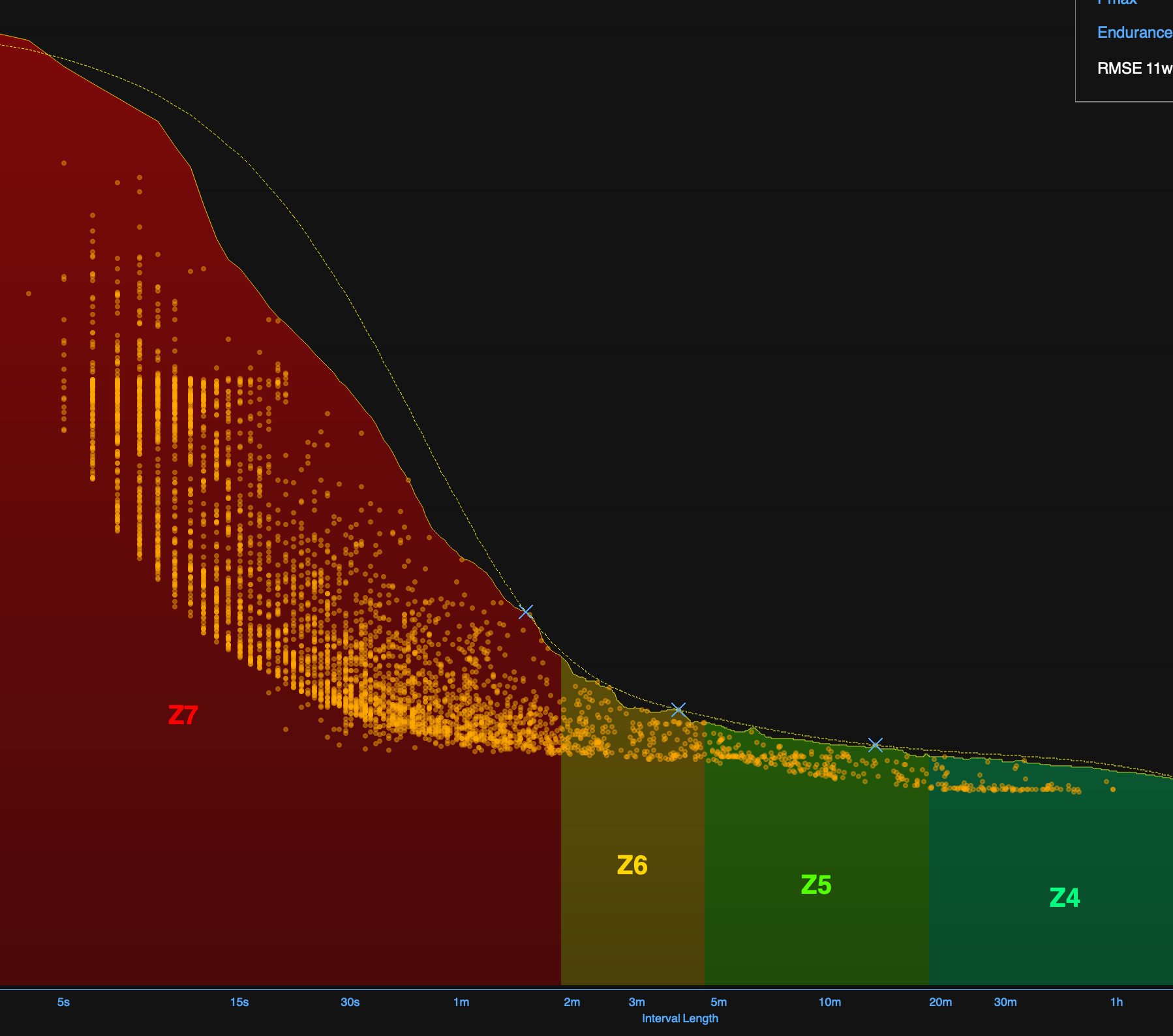
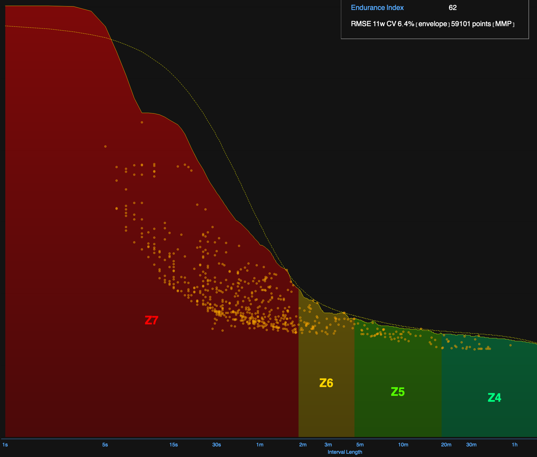
But it looks for top sustained efforts and plots them. Looking at the charts below the sustained effort points have a lower boundary - I tried doing some quick calcs for of some in Z7 (zone 7) but couldn’t figure out the details without spending more time.
So for example when I was hammering away like crazy and doing a lot of sustained near maximal efforts it looks like this: