A simple one would be Train Tomorrow, my plan doesn’t have anything in for tomorrow but I would like to put it in the calendar to look forward to but right now it’s saying to chill out as I have had a good workout today.
9 Likes
1100+messages, apologies, I didn’t read any of them so this may have been mentioned before 
A simple thing: have a setting that only workouts with instructions are suggested (in TrainNow, Adaptations and when building a Training Plan).
Don’t worry, TR didn’t either 
9 Likes
Can we have an option like Training Peaks to put your equipment in and then select the bike from the drop down for each workout on the calendar. It would be useful for me to be able to look back and potentially see trends with equipment use. Plus I’m a geek and it would just make me happy to have that data on the calendar.
2 Likes
Hi,
I have active plan for bike but due the work, I am forced to travel - so I am replacing my bike scheduled training with running or inline scatting - can I get recommendation how to convert bike plan to running plan? I am now doing it base on my experience, sometime I am successful sometime not.
Thank you
Lada
2 Likes
I’d like the ability to manually declare a day as Yellow or Red.
I’ve been mixing a lot of other kids of activities (rucking, lifting, yoga, …) along with some diet changes and I’m regularly pushing into overreaching status. While I am currently using annotations to denote this, having the option to get the full visual impact on my calendar being in Yellow/Red status would be appreciated.
3 Likes
We all think that you’re wonderful.
1 Like
I’d like duathlon plans.
5 Likes
The ability to click on a TR workout and directly upload the completion file (e.g., FIT, gpx, etc.) instead of having to do the current multi-step process:
- Careers → Activity List - > Import Activity
- Calendar → [imported activity] → associate the imported activity with a TR workout
2 Likes
System that automatically converts podcast discussion units to whatever are your local/desired units
Maybe even with AI that mimics the speaker’s voice to make it sound natural, but that’s kind of scary, so maybe deliberately make it sound different.
I’d like to add that the AI/Machine Learning also needs to know that I’ve deemed myself in Yellow/Red status. The manual entry I’m doing today looks like I’ve just taken a day off and would be more rested up to tackle even more difficult workouts.
3 Likes
This points to TR need a survey for how we are feeling - this could be across many dimensions, e.g., mood, fatigue, motivation, etc. - prior to doing the workout.
I’m not saying TR needs all of these, but this is what TrainingPeaks allows one to track

4 Likes
One the one hand, this would be cool to capture. On the other hand, when I’m done with a ride, the last thing I want to do is spend time filling out a survey.
5 Likes
A survey like I showed should be completed first thing in the morning / hours prior to your ride. It isn’t a post ride survey that would be impacted by how your workout went / what the impact of your workout was
2 Likes
I use AI FTP detection and I find it is always a mystery as to what type of result I am going to see. Sometimes, I know it’s not going to be a good result because I have been missing planned workouts or sick, etc. However, there are periods of time when I am hitting all the workouts and could use some encouragement. I think it would be helpful to get a weekly summary email from TR that highlights the prescribed power zone targets for the week versus what has been completed. AI should also be able to look ahead and evaluate the upcoming workouts and project what FTP will be achieved if the remaining workouts in the 4 week block are completed.
7 Likes
Probably not an original thought but as Best Bike Split has come up on the podcast a few times recently, being able to input a course (and goal time) into the training plan to give you prescribed volume and w/Kg to make it happen.
Upload Leadville, goal is 10 hours…AI determines I need to do 9 hours a week, 3 interval sessions a week, etc.
3 Likes
When I do a non-TR outside ride using my Garmin, Garmin pushes the date to Strava and to TR.
Strava then notifies me though its app that it’s received the file.
It would be cool if TR would do the same and prompt for a RPE survey response at the same time - it’s easy to forget to do this.
6 Likes
I like this. Adding the TR estimated intensity and time is helpful, but it leaves me with doubts about the specificity in the (short) route I will be attacking, as a C-event and fitness test.
There is a 5.3 mile climb that I want to get under 30 minutes, 4 - 7% grade. I chose the road mountain climbing block for it. I am feeling progress, but I am not sure if the changes are optimal for the exact kind of challenge I am targeting.
I was hoping that I could insert a map file and TR could crunch the elevation profile, as you described, and return a plan with that.
This is the paradigm for Xert and for Join I think as well. Seems like it makes a lot of sense.
Coming from Wahoo SYSTM, there’s a whole lot of stuff that Trainer Road does much better, but there are some smaller UI things that I think that the SYSTM app does better which would be great if the TR app could develop their own solution:
- Semi-transparent app window background (option/switch) so that I can see my YouTube/Spotify/etc through it. As I have to bring my own entertainment in TR, I rely on other apps on-screen to do that and being able to see them (e.g. youtube progress bar, subtitles, etc) just makes usability during a session much nicer.
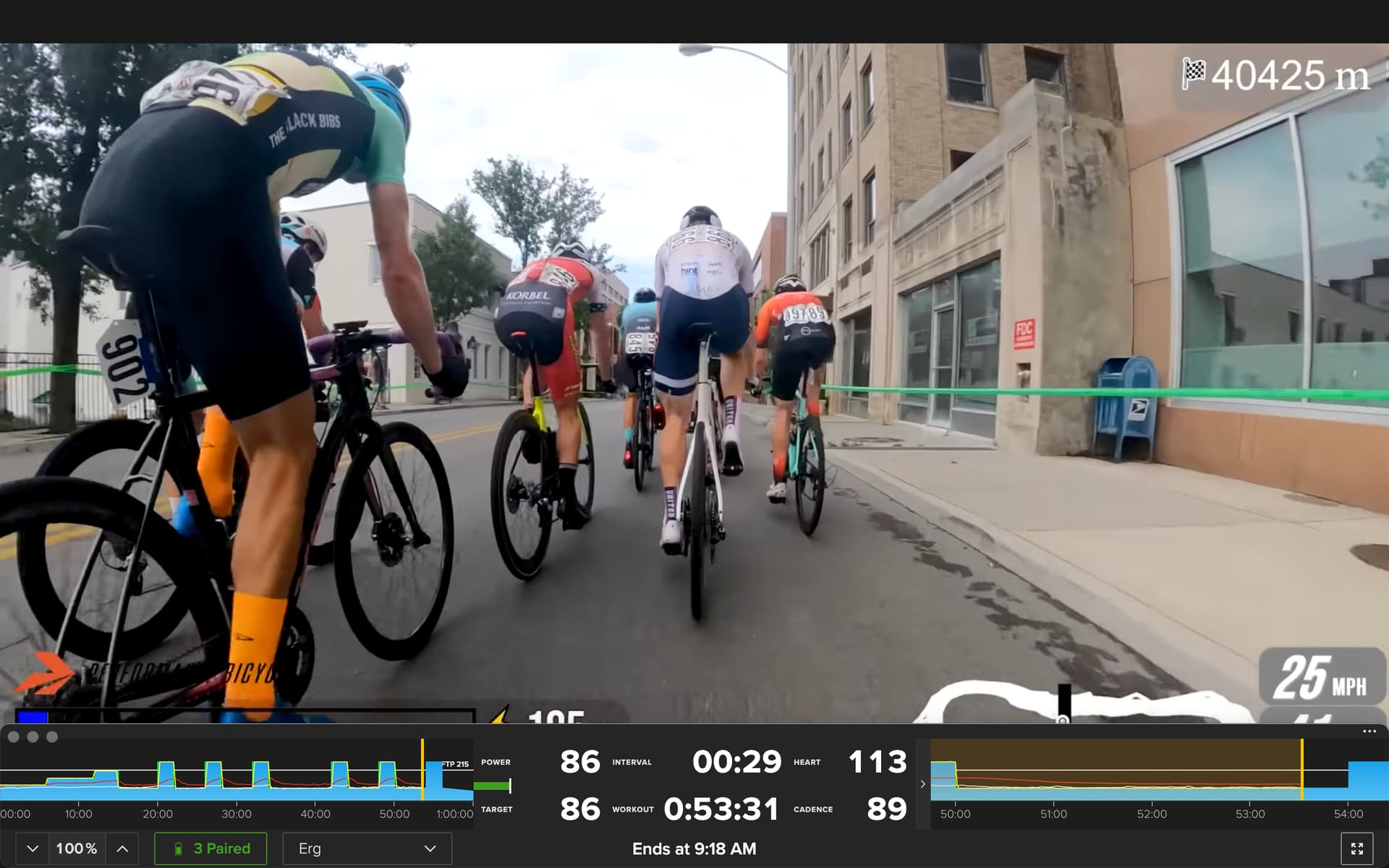
- The mini view right hand progress graph is pretty much useless. It’s too small to see the power level targets in detail and it just shows the interval which is constant power by definition, whereas what I want to know is the transition. Effectively it’s just a visual countdown, and we already have that in the centre display.
- Use icons instead of words in the mini display and move them to the right of each data value so that they can be closely aligned. Use the full display to show icon and words so that new users quickly become familiar with their meaning. In the above screenshot the word “Interval” is very close to the “86”, similarly with the other values and their labels. I need to be able to look at the values and not have to think, especially during a hard intervals session.
- The power vs target bar is next to useless during ERG mode and is just unbeautiful in the UI
- Using the same y-axis values for power, HR and cadence makes absolutely no sense for UI, even with my lowly 200+ FTP. This is both in the app and TR’s analysis web page.

Same data, but much clearer to see the actual HR and cadence values:

These are all UI tweaks that would greatly improve my experience during regular use of the app.
7 Likes